In this article:
- Font
- Size and Scaling
- Hierarchy
- Alignment
As it is the visual representation of language, typography is designed to communicate information to those consuming content through visuals. Typography should be designed that the first and most important aspect is conveying and communicating this information. Style should never get in the way of that goal. In this article, we’ll discuss how the Fission design language was designed around helping users understand the content of the application with ease and efficiently.
Font
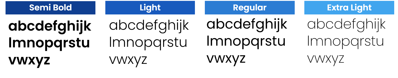
We designed Fission Design Language after taking apart what we believe to be the core concepts of design. The first thing we did when creating the design language was to create a distinct font that stayed true to the fonts we had used in the past, which were Open Sans and Sharp Sans.
This is how Jumeeno was born. Jumeeno is designed to maintain optimal legibility no matter what size or resolution screen is being used. It is clean, distinct and can be scaled anywhere from bold to thin to suit any application’s aesthetic. The Jumeeno font compliments the application and the system it is running on.
JUMEENO
Size and Scaling
When working with Jumeeno it is important to note that on Microsoft’s Windows 10 operating system (the primary target for software using the Fission Design Language) that all UWP applications automatically scale on all devices. The scaling algorithm is in place to ensure that a 16px font on a display 5 feet away obtains the same legibility as a 16px font on a 5 inch mobile device in the palm of your hand.
The size of Jumeeno should never be used at a size smaller than 12px.
Hierarchy
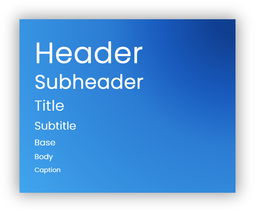
Users rely on visual hierarchy cues when scanning a page. This is why we have headers and body text formats. Headers summarize the content (Title, Subtitle / Heading, Subheading), whereas the body text contains more detail.
Alignment
The default Text Alignment for most font and language cases in Left. In most instances, flush-left and ragged right provides consistent anchoring of the content and a uniform layout.
Feature Photo by Aleksandar Pasaric from Pexels