In this article:
- Interactive Elements
- Enhancing a UI with Shadows
- Balancing Depth with Shadows
Designing an application with a modern, sleek and flat design often presents challenges for designers in the usability of the application. Design Languages tackle this by adding a level of depth to objects in the application to let the user know that they are interactive, to be seen first, to be seen last and much more.
Interactive Elements
One of the most important uses for depth within a design language is it’s ability to point out interactive objects to the user. In early design this was done by making the interactive elements appear three dimensional. While this is an effective use, it is widely considered outdated as it was popularized in operating system design languages from the late 1990s and early 2000s. This 3D “Bevel” approach lets the user know that it can be pressed as it can provide visual feedback, often becoming a flatter texture when pressed on.
Modern UI design typically consists of a more flat appearance in interactive elements. In the case of Windows 10, buttons are not three dimensional and do not approach design with “Bevel”. Windows 10’s “Fluent” design language instead highlights interactivity using lighting effects rather than Depth. When you hover your mouse near an interactive element, the lighting around (and on) the element react. The depth of the application and it’s elements is all done on a two dimensional plane.
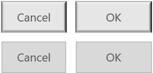
We can see how a window with flat buttons appears in a user interface using the image below:
an example of a typical, flat modern UI design.
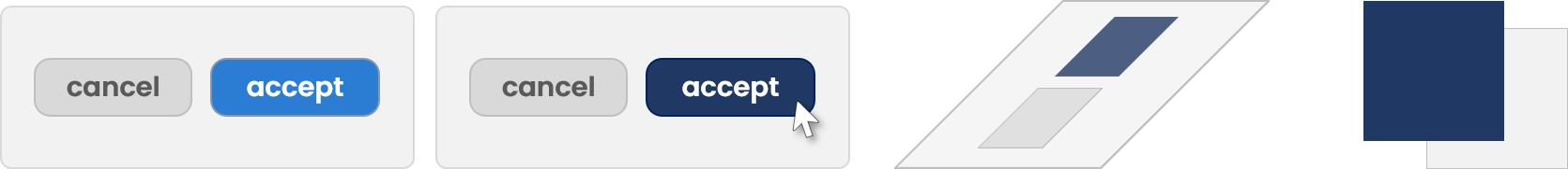
The Fission Design language tackles interactivity differently to this by utilising Depth over lighting effects. Fission UI Elements that are considered to be an “interactive element” (can be interacted with using a pointing device) are designed to appear closer to the user than the rest of the application. We achieve this by using Shadows to create an artificial depth on a two dimensional plane.
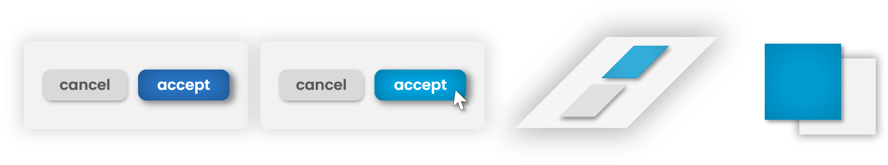
an example of Interactive UI Elements using Fission Design.
In the image above, we demonstrate a small window with buttons. Buttons are one of the most common interactive elements in a user interface. Fission UI brings these buttons closer to the user thanks to the smart use of shadows to create a depth separation between the UI Window and the interactive button elements.
These buttons then, when hovered over, provide a darkened shadow as well as lighting responses found in other design languages (such as Windows 10) by changing a visual lighting change to the button. In the example above, this is achieved by creating an artificial spotlight above the centre of the button, creating darker edges that almost blend into the shadows.
Enhancing a UI with Shadows
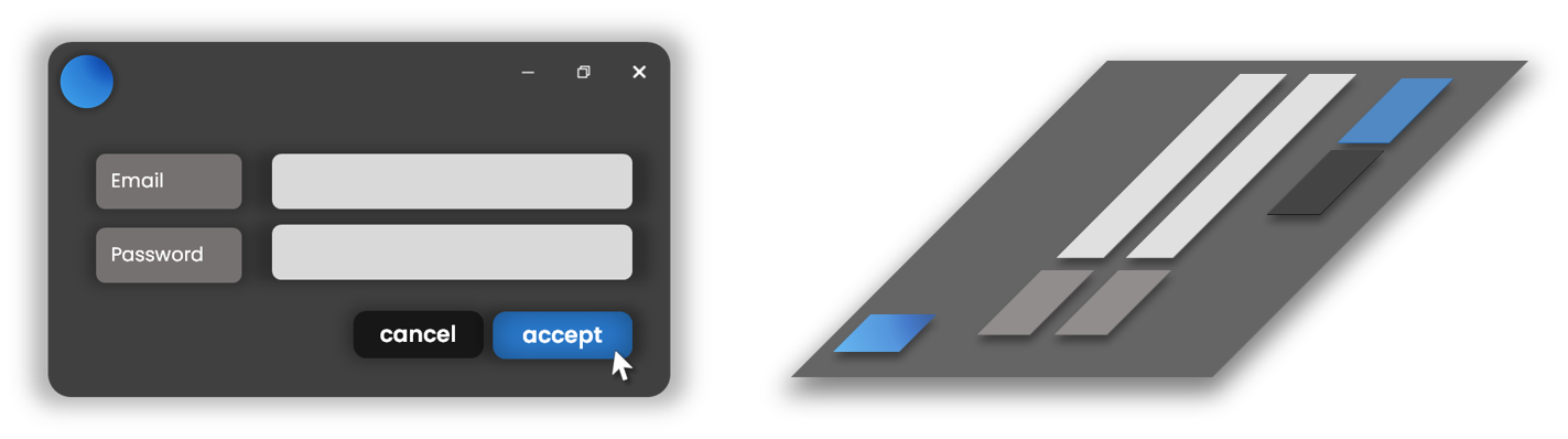
a visual representation of the depth of several Interactive UI Elements using Fission Design.
As you can see in the image above, when we lay the application down on it’s side (using some pretty nifty software and photo editing tricks) we can see the way that depth has enhanced the application. It is clear to the user that there are interactive elements as they are lifted towards the user, while the rest of the application that isn’t considered interactive is pushed into the background. In comparison, if we are to remove the shadows from the design, it becomes less intuitive as the UI elements all exist together on a two dimensional plane that includes no definition to distinguish interactive elements from the rest of the application.
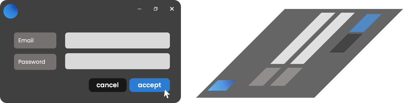
a window with interactive elements not highlighted with shadows.
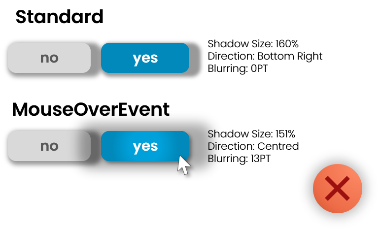
Balancing Depth with Shadows
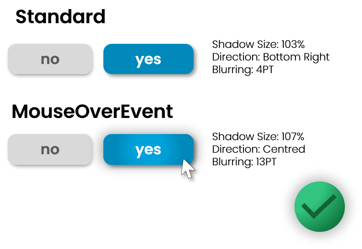
Fission UI Design should include shadows that are tasteful, subtle and yet still achieve the goal of creating depth and highlighting elements of the application that are important, interactive and featured. In most cases shadows should be oriented Bottom-Right by default and then when hovered over, expanded to Centred. We also recommend a sensible blurring and shadow size. It is unlikely that the shadow ever needs to be bigger than 110% (100 being the size of the button, 110 being 10% additional size of the button created by the shadow.)